
Role
User Researcher and Product Designer
Date
October 2024 - January 2025
Tags
Solo project, Mobile app, UX/UI design, End-to-end process
Tools
Figma, Figjam, Canva AI
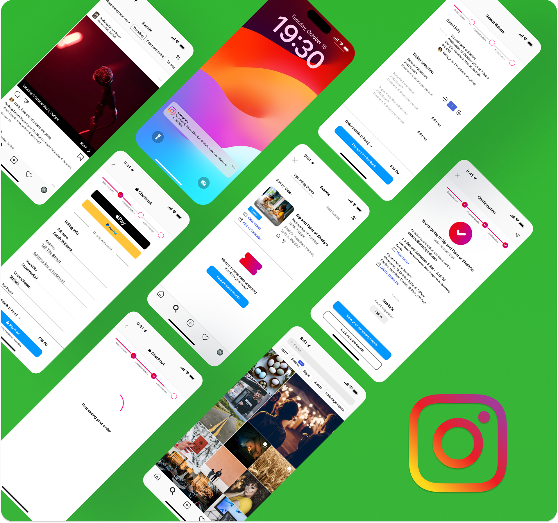
Final designs of the Instagram Events app.
Project overview and goals
Instagram Events: Connecting communities through local experiences
I designed Instagram Events, an intuitive concept feature within Instagram, to empower residents in rural areas to discover upcoming gigs, explore local events, and browse nearby venues easily.
Goals:
• Help users easily discover local events based on interests and location.
• Improve ticket purchasing, RSVP, and reminder processes.
• Increase user engagement and retention through social interaction around events.
Initially planned as a standalone app, research showed that integrating event discovery into Instagram would create a seamless, accessible experience. This would leverage Instagram's engaged user base for social-driven events, especially as it is used by 86% of 16-24-year-olds.
The problem
Young people in rural areas often struggle to find local events
In 2016, a NASAA Arts study revealed that rural residents, relying on fragmented communication channels, struggle to stay informed about local events.
By 2024, Virgin Media / O2 research showed that two-thirds of rural 16–24-year-olds were considering leaving their towns due to limited opportunities.
The challenges identified within the papers included:
• Lack of accessibility: Local events were challenging to discover and poorly promoted.
• Inconsistent tools: Residents relied on fragmented platforms like Facebook, posters, or word of mouth.
• Community isolation: Young people felt disconnected from local social opportunities.
The solution
Instagram Events brings a unified solution by integrating event discovery, RSVPs, and ticketing into one seamless platform
Personalised event feed:
Discover events based on interests, location, and friend RSVPs.

Integrated RSVP and ticket purchasing system:
Users can select RSVP and ticket types, adjust quantities, and complete payments using saved payment methods without leaving the app.

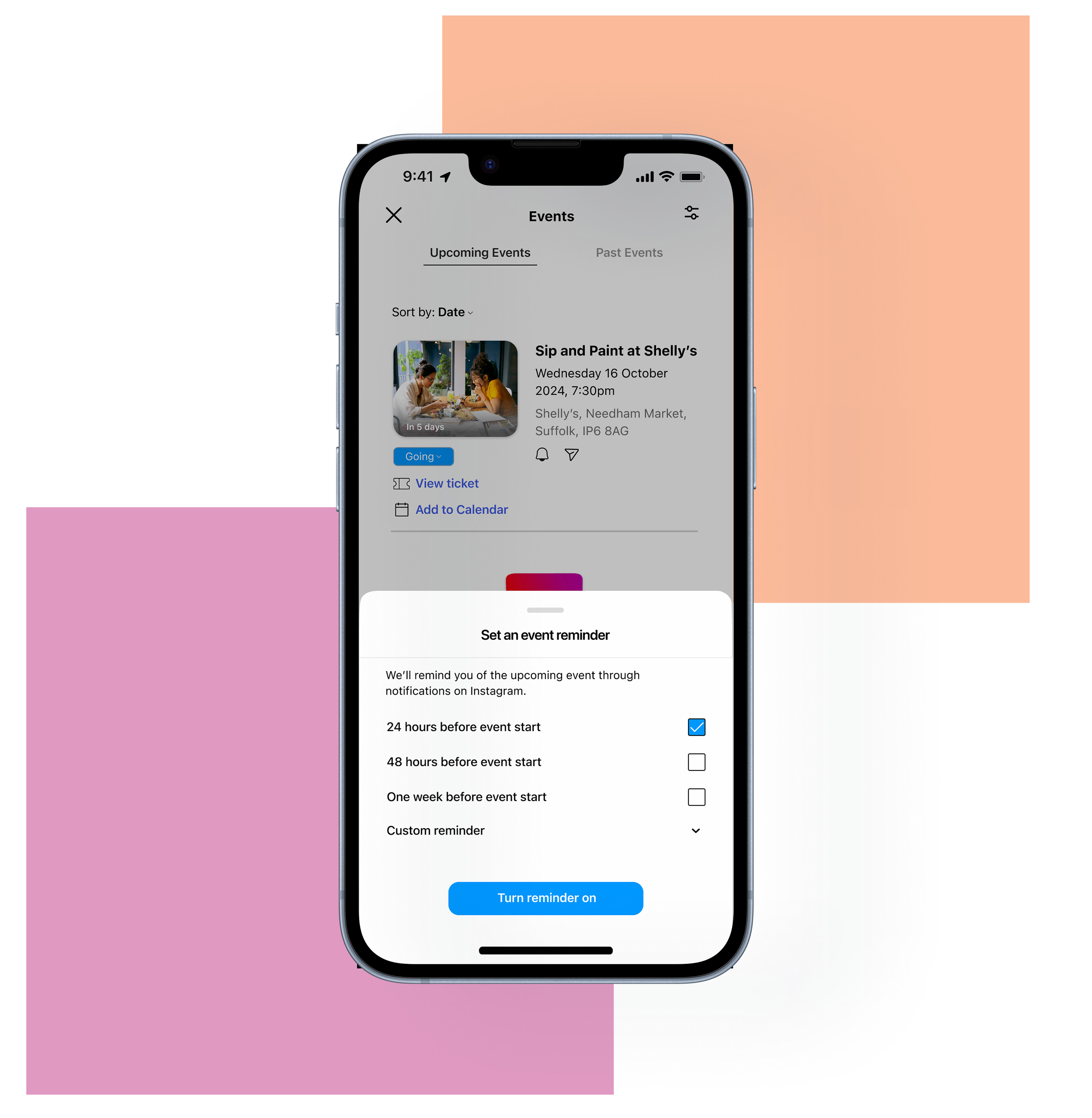
Reminders for upcoming events:
Users can set personalised notifications for events they’re interested in, ensuring they never miss out.
Scope and constraints
Understanding Instagram's ecosystem to deliver value
The scope of this project focused on designing a seamless way for users to discover, RSVP, set reminders, and purchase tickets for local events within Instagram’s Explore tab.
Key constraints for this concept project included preserving Instagram's navigation and visual identity, minimising disruption to the app experience, and utilising limited external resources, such as their official brand site and tools such as Mobbin for design references.
Users and audience
Young, social & seeking connection
The core audience was 16–24-year-olds living in rural areas. These are socially active, mobile-first users who rely heavily on Instagram for connection and inspiration. They value simplicity and visual content and want local events to be as easy to discover and plan as trending content.
User interviews
User insights highlighted the demand for a unified event platform
Building on NASAA and Virgin Media/O2 findings, I hypothesised that a social-driven event feature could enhance accessibility.
I interviewed 12 participants aged 16–24, including students, young professionals, and casual Instagram users living in rural areas. I explored how they currently find local events, what challenges they face when planning with friends, and how they feel about the social and entertainment options in their area.
From these interviews, three main pain points emerged:
• Difficulty finding relevant events in one place.
• Uncoordinated planning with friends.
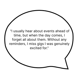
• Forgetting events after discovering them. One participant added:
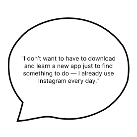
A participant also revealed a preference for familiar solutions and avoided the need to learn a new app. They said:
With the challenges in mind, I asked:
How might we help young people in rural areas discover and attend local events more easily by embedding a social-first solution within the platforms they already use, like Instagram?
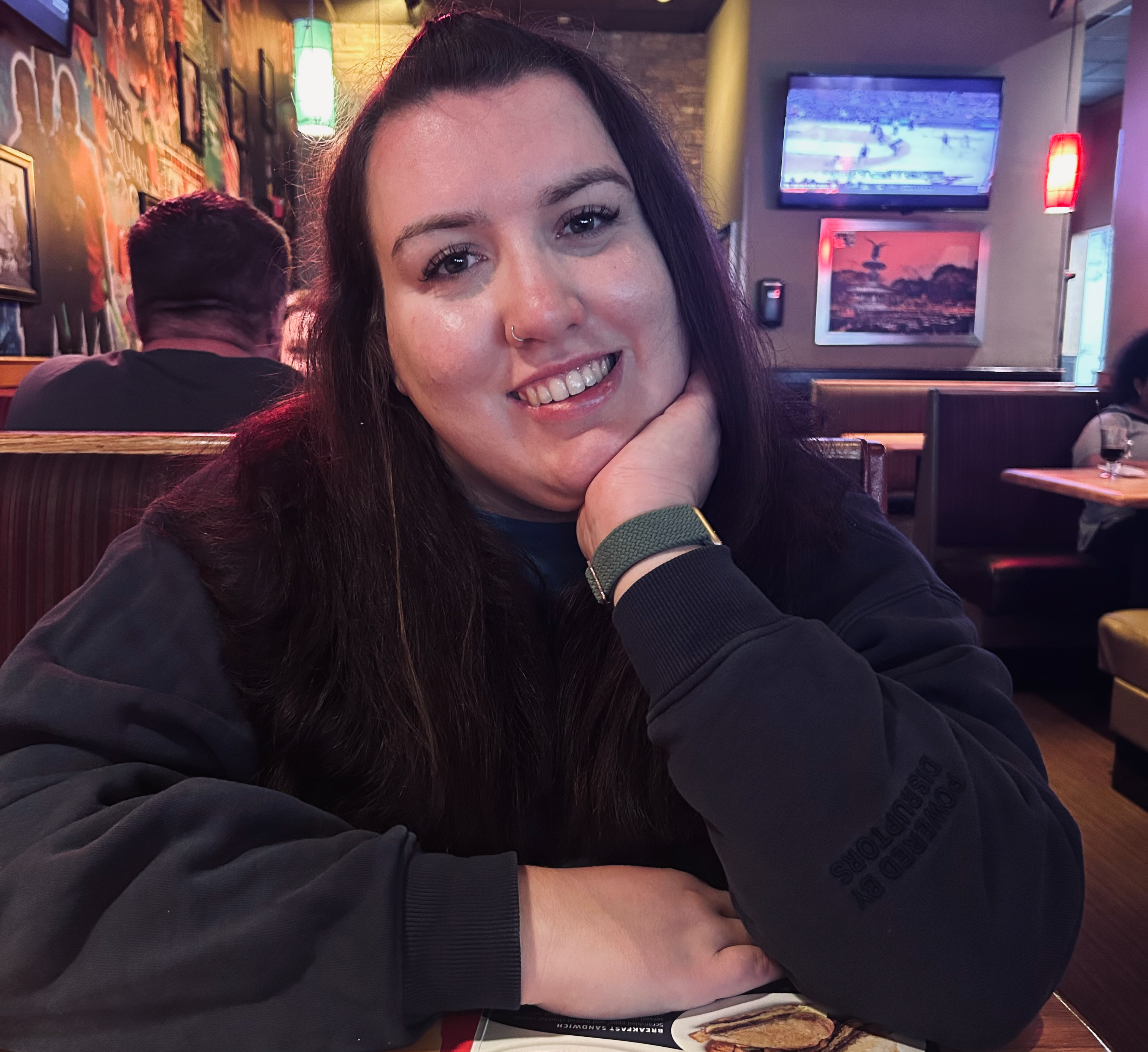
User persona
Introducing Sarah – The social explorer
To ensure Instagram Events meets real user needs, I developed a user persona that illustrates how users discover, plan, and attend events.
Sarah, 20, loves music but struggles to find local events due to fragmented discovery across platforms. She wants a seamless way to discover, plan, and share events with friends, aligning with Instagram Events' target audience.
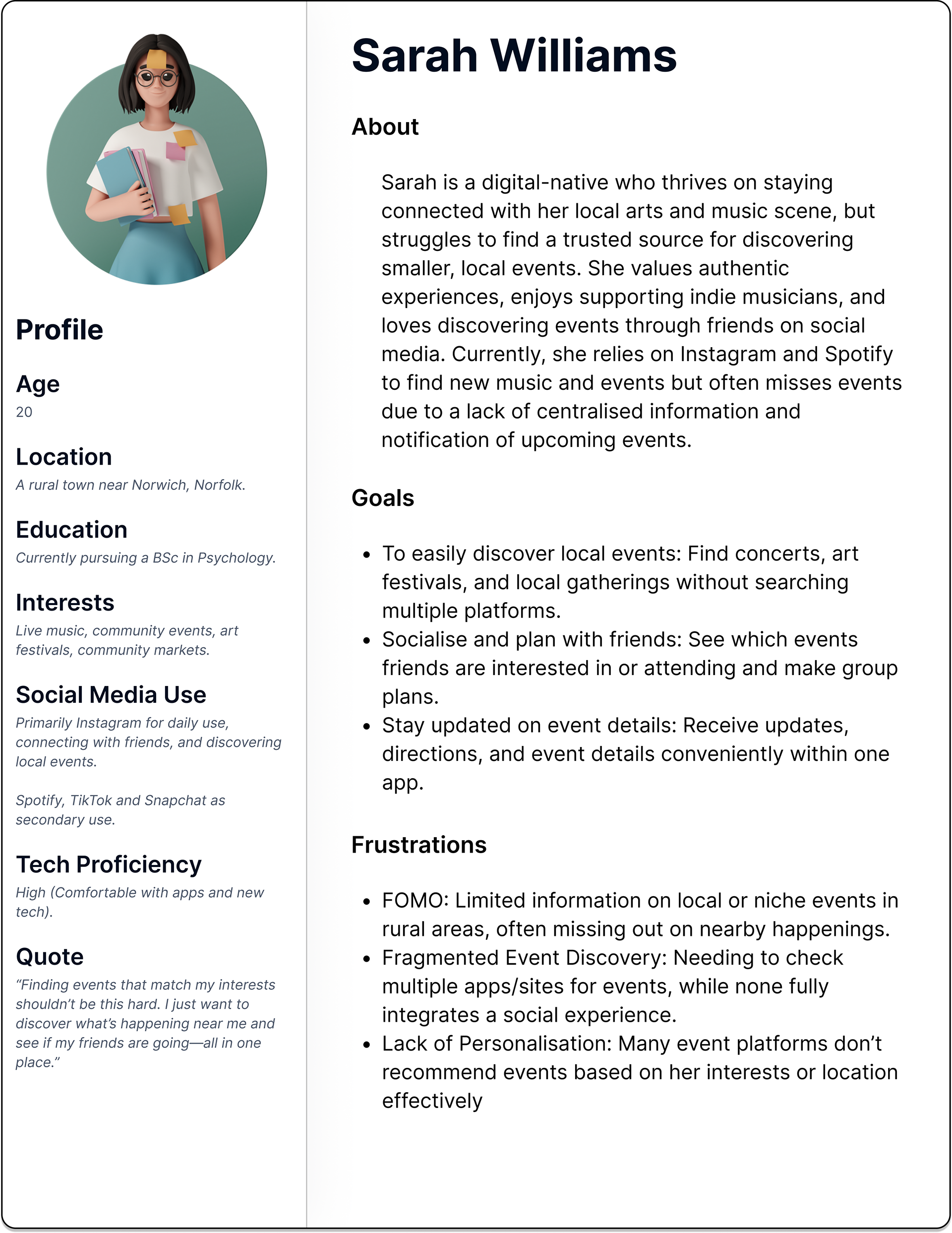
Sarah Williams - Instagram Events' key user persona
Ideate
From concept to reality: Crafting low & high-fidelity designs
To translate insights into a tangible solution, I first created low-fidelity wireframes to map Instagram Events' user journey and core functionalities.
The wireframes represent the flow persona Sarah would take to discover, RSVP and purchase a ticket to an event, then offer her the opportunity to share the event with her friends and set a reminder so she doesn't miss it.
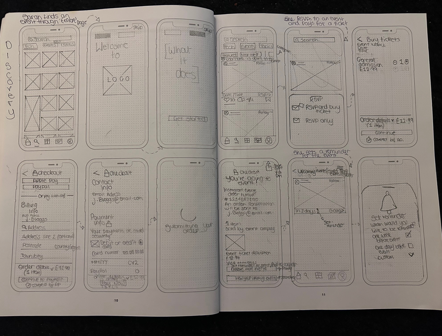
My low-fidelity wireframes (sketches)
When designing the high-fidelity wireframes for Instagram Events, I ensured a seamless integration with Instagram’s existing UI and interaction patterns.
I followed Instagram’s design language to ensure visual consistency by using its iOS typeface (SF Pro), core brand colours, and common interface colours (blue, black, and white) in Figma, promoting content visibility and a cohesive user experience.
I designed custom components that replicate Instagram’s interaction patterns, such as swipe gestures and bottom navigation—to ensure a native and intuitive user experience.
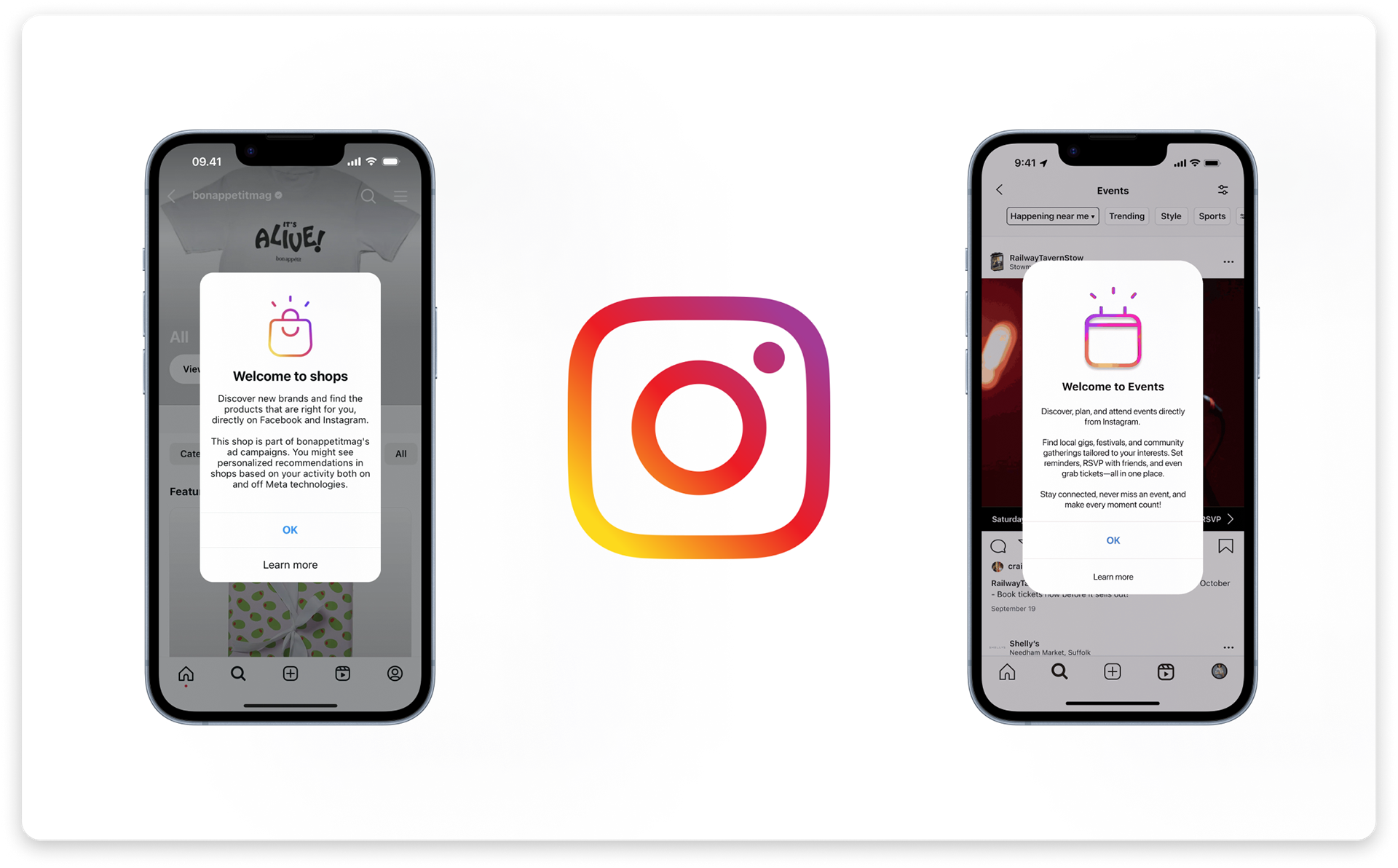
Instagram presents its new features using an overlay, such is presenting their 'shops' feature (left). I created a similar function when presenting Instagram Events to the user for the first time (right).
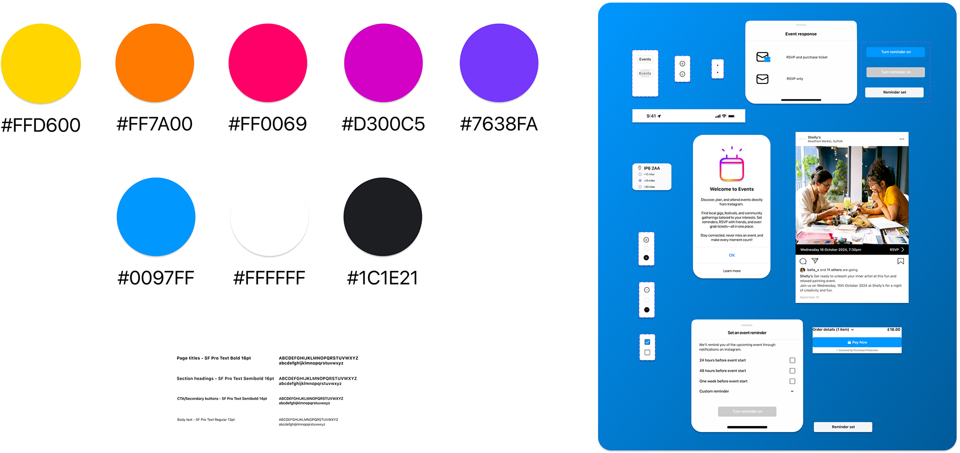
I created this style guide and bespoke components for Instagram Events, based on Instagram's branding and functionality
Usability testing and iterations
Improving what matters: Iterations that enhanced the experience
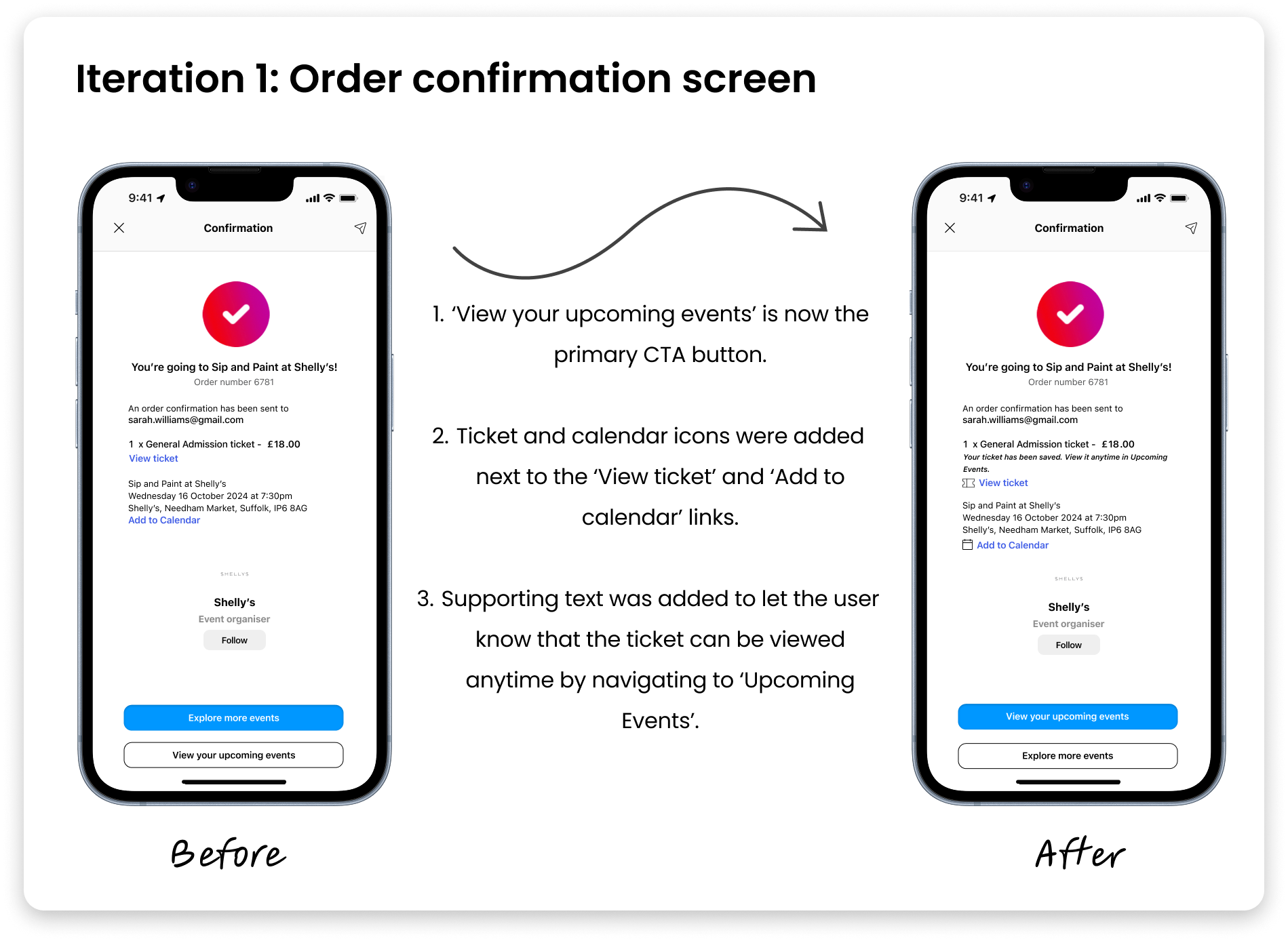
Iteration 1
During design review, my mentor shared a valuable insight from the perspective of a first-time user:
This highlighted a gap in the user journey: users lacked a clear next step after completing a purchase. Instead of confidently accessing their tickets, they risked repeating the journey or repurchasing in error.
As a result, I iterated on the confirmation screen:
• After purchasing a ticket, the user's primary concern could be “Where is my ticket? Can I access it later?”. Making “View your upcoming events” the primary CTA instantly answers that question.
• I styled the page more prominently and added small ticket and calendar icons next to the ticket purchasing and calendar links for clarity.
• Supporting text was added to reassure users that their ticket was saved and accessible anytime.
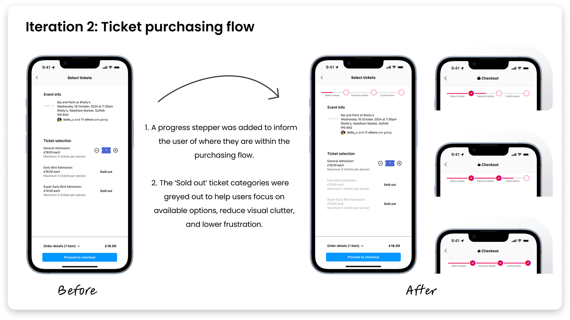
Iteration 2
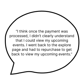
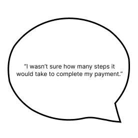
During usability testing, a few users expressed uncertainty during the payment process. One participant noted:
This feedback revealed a lack of clarity around the purchase journey, which led to hesitation and reduced user confidence during checkout.
To address this:
• I introduced a progress stepper to the checkout screen. The stepper outlines the user's journey from reading about the event information to purchasing the ticket, helping manage expectations and reduce perceived friction.
• Additionally, I greyed out the sold-out ticket category text to reduce cognitive load and guide user focus, ensuring users could easily identify unavailable options without distraction.
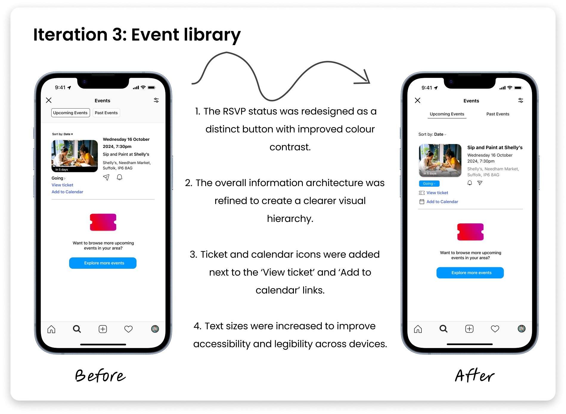
Iteration 3
Finally, users appreciated seeing which events their friends had RSVP’d to. However, several participants noted that their own RSVP status wasn’t clearly visible once the event was added to the 'Upcoming Events' tab. One participant said:

This created a gap in user confidence and made event tracking more cumbersome than it needed to be.
To address this:
• The RSVP status was redesigned as a distinct button with improved colour contrast, making it easier for users to identify their attendance at a glance.
• The overall information architecture was refined to create a clearer visual hierarchy, ensuring the event name, date and time, and location are easily scannable.
• To enhance clarity and visual feedback, icons were added next to the ‘View ticket’ and ‘Add to Calendar’ links. Additionally, text sizes were increased to improve accessibility and legibility across devices.
Results and impact
Better engagement, clearer journeys
After three rounds of testing and iteration:
• 90% of the ten test participants successfully located and accessed their RSVP’d events without external guidance.
• 70% of participants said the updated RSVP status and confirmation flow made them feel more confident that their ticket was saved.
• 60% reported that the new reminder option would help them avoid missing events they were excited about.
• Visual hierarchy improvements helped users identify the event title, date, and status within 3 seconds on average.
Takeaways
Lessons learned
This project highlighted the value of designing within trusted ecosystems. By embedding the feature within the already existing Instagram app, I created a seamless, intuitive experience for users without requiring them to learn a new app.
Small changes like clearer RSVPs, improved ticket confirmation feedback, and subtle visual tweaks greatly enhanced usability. It highlighted the importance of early user interviews in creating effective solutions.
Accessibility was another key takeaway. From font size to colour contrast, every decision contributed to a more inclusive, confident user experience.
I truly enjoyed completing this project and would like to thank my mentor and all the research participants for their assistance.