
Role: Product Designer
Team: Content Designer, Researcher, Photographer, Accessibility Tester, SEO Specialist, Dev team and wider web redesign team
Tools: Figma, Miro, Jitter, Google Analytics
Timeline: April – May 2025
Impact Summary:
• Designed a people-first ‘Meet the Team’ page to boost trust, clarity, and engagement.
• Conducted light guerrilla testing with 5 users to validate flow, readability, and emotional tone. Eighty per cent said it made them more likely to volunteer.
• Helped spark strategic conversations around brand storytelling and accessibility.
• Prototype received strong stakeholder feedback: “Amanda has done an amazing job with the prototype.” - Project Manager

Project overview and goals
So, what is East London Waterworks Park?
East London Waterworks Park (ELWP) is turning a disused 14-acre Thames Water depot into a vibrant, biodiverse, community-run paradise. I joined the mission as a volunteer product designer, and my first task was to redesign their ‘Meet the Team’ page, because nothing says “trust us with a park” like a bunch of friendly faces and a solid call to action!
Goals:
• Enhance user engagement through authentic storytelling and compelling visual design.
• Ensure long-term sustainability with a flexible, easy-to-maintain system.
• Increase volunteer interest and sign-ups post-launch.
Business problem
A gap in transparency
Before the redesign, the people behind ELWP were hidden in the shadows, mentioned briefly in the FAQ section. There was no dedicated team page, which made it harder for new visitors, press, or potential funders to understand who was actually driving the project. It created a gap in transparency and trust that felt at odds with the charity's openness and community spirit.

The current ELWP website provides only a limited overview of the directors and volunteers, hidden behind the 'Frequently Asked Questions' section.
User impact
User research revealed that the website lacked a personal connection
From looking at Google Analytics, the current website attracts over 1500 unique users monthly, but average engagement is just 1 minute and 25 seconds. Previous user interviews echoed this, revealed visitors couldn’t easily see who was behind the project.
One user even mentioned,

They needed a more personal, accessible way to connect with those involved.
So,
How might we make the East London Waterworks Park website feel more personal, relatable, and community-driven so visitors feel more connected and inspired to get involved?
The solution
Personalising the park: Building a connection with a 'Meet the Team' page
We created a ‘Meet the Team’ page to foster human connection and engagement. It showcases the passionate volunteers behind ELWP and aims to encourage visitors to interact more deeply with the site through storytelling and visuals.

The final design of the ELWP 'Meet the Team' page.
Scope and challenges
Balancing vision with volunteer realities
This project focused on designing a new Meet the Team page for ELWP’s wider website redesign. My role included:
• Researching team pages from non-hierarchical organisations.
• Designing a responsive, accessible page aligned with the new brand direction.
Key challenges and how we overcame them:
Coordinating around volunteers' personal and work commitments:
• During our initial workshop, we mapped out everyone’s availability and capacity.
• We created a dedicated Slack group to enable asynchronous communication and reduce delays.
Tight deadline alignment:
• The team shared progress regularly with the lead designer of the main web redesign team to stay aligned.
• We made incremental updates to keep momentum while staying flexible.
Collaborating across multiple teams for input and approvals:
• I attended bi-weekly comms calls to share updates with stakeholders, developers, and directors.
• I actively sought input at each key milestone to reduce late-stage revisions.
Users and audience
From curious visitors to committed contributors
The 'Meet the Team' page was designed with multiple audiences in mind, all of whom engage with East London Waterworks Park in different ways:
• Residents and community members who are curious about the project and want to understand who is behind it.
• Potential volunteers seeking a sense of the team culture, diversity, and values before getting involved.
• Supporters and donors looking for transparency, credibility, and a human connection to the cause.

Kick-off meeting and desk research
First steps, shared vision
We kicked things off with a workshop to determine who was actually available (spoiler: not everyone at the same time). We also:
• Mapped responsibilities across design, content, and accessibility
• Conducted a competitor analysis of team/about pages from similar community and environmental organisations
• Identified preferred layout and photography styles.
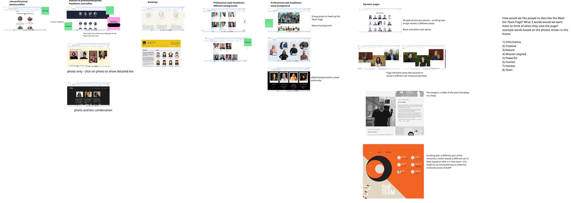
Our Miro board of photography style analysis
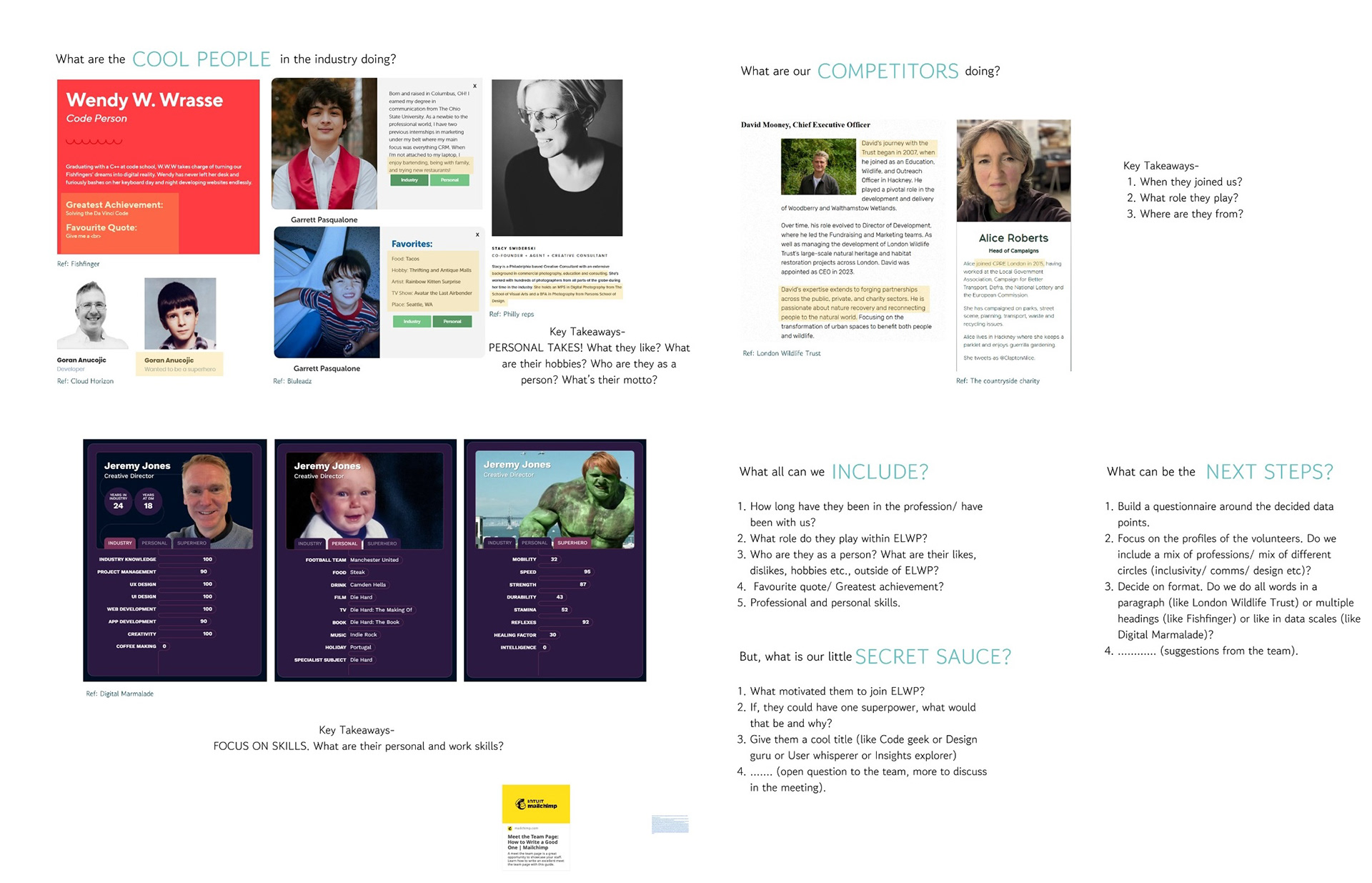
Our Miro board of various 'Meet the Team' pages of competitors
Concept development
Celebrating community through story
Following our initial workshop, we analysed team pages from grassroots campaigns, creative collectives, and mission-led organisations. Key insights included:
• Story-driven bios create stronger engagement.
• Flexible layouts suit collaborative, non-hierarchical teams.
• Consistent tone and visuals build trust.
I took what we learned from the workshops and the previous user research and designed three concepts that align with the transparency and storytelling of volunteers and directors.
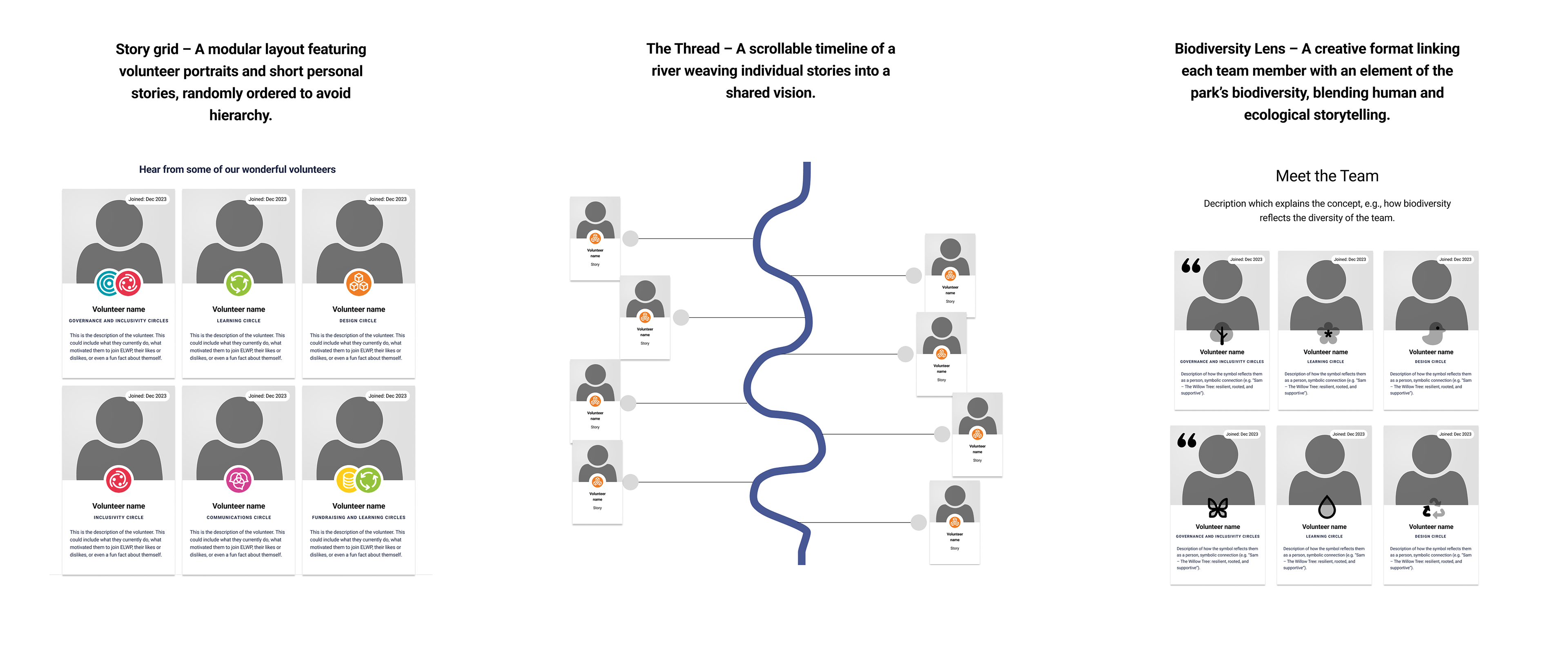
Story Grid, The Thread and Biodiversity Lens design approaches I considered
We chose Story Grid for its clarity, mobile usability, and easy maintenance.
Design and implementation
Building a story-led page that can grow with us
With the Story Grid concept selected, I designed a clean, story-led layout that could scale with ELWP’s growth.
• I used ELWP’s rebrand palette, balancing vibrant and earthy tones to reflect nature and community.
• Focused on simplicity and inclusivity to let team stories take centre stage.
• Built a responsive, card-based layout optimised for mobile and desktop.
• Ensured accessibility through strong contrast, scalable text, and keyboard navigation
The first mockup was tested with real content to check clarity, tone, and scalability.
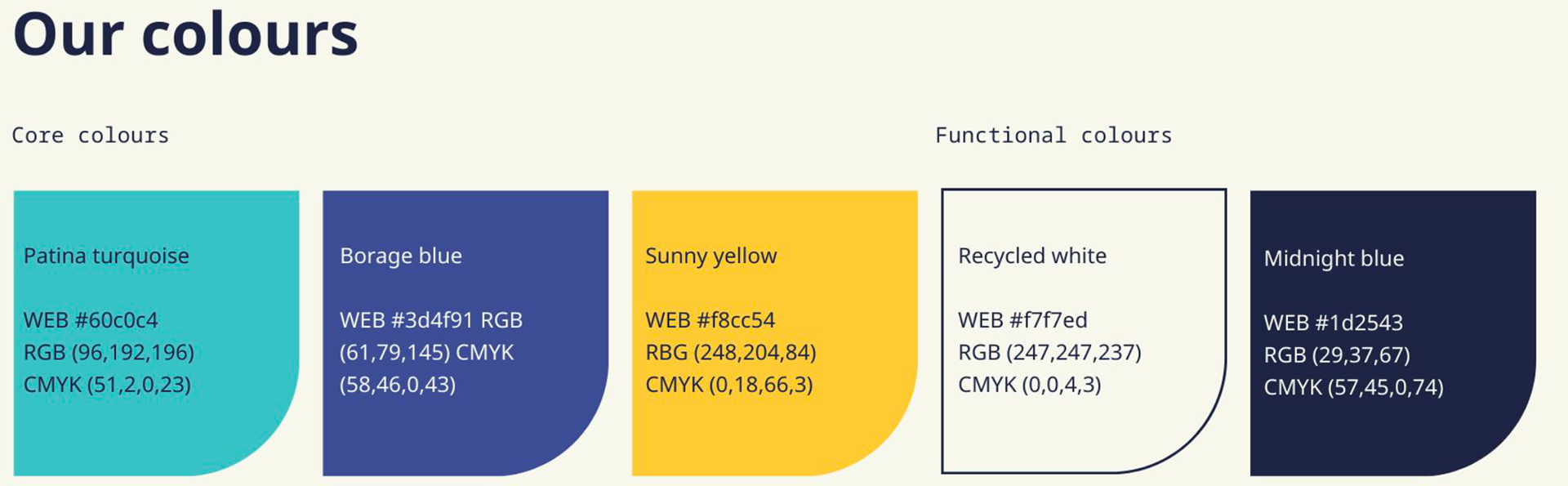
ELWP's updated colour palette is part of their rebrand.
Iterations
Designing for everyone, through iteration
I shared the mockup with the team, and the feedback was positive. However, suggestions, including this one, were made:
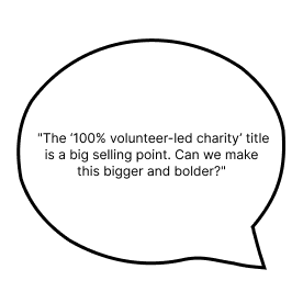
• I highlighted the “100% volunteer-led” status with bold text and a bright yellow accent from the brand palette to emphasise the USP to visitors. I also used Jitter to animate the USP.
• I also added a clear CTA button encouraging visitors to sign up as volunteers.

Iteration 1: Emphasising the USP
Furthermore, feedback from the accessibility team included:
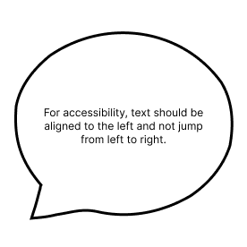
I improved this by:
• Left-aligning images, followed by text for better readability.
• Adding visual hierarchy: I added the quotes from the Directors, which our content designer finalised and increased the font size, to amplify authentic volunteer voices.

Iteration 2: Improving accessibility
Results and impact
A more human tone + personal success
The design was well received by the ELWP team. It was praised for its balance of storytelling, clarity, and alignment with the organisation’s values. While I do not have metrics for the page, I did conduct some guerrilla testing on potential volunteers.
The page will go live once the website redesign is complete.
From user testing (5 participants):
• 100% felt more connected to the project through personal stories.
• 100% better understood how to get involved.
• 80% said it made them more likely to volunteer.
Personal milestone:
Following this project, I was promoted within ELWP’s design team!
Reflection
Strengthening collaboration through better documentation
If I were to revisit this project, I’d improve collaboration by documenting version changes and design decisions more clearly. This would support smoother teamwork, especially in a volunteer-led environment where contributors join asynchronously.